
Inserting Images in Excel Worksheets
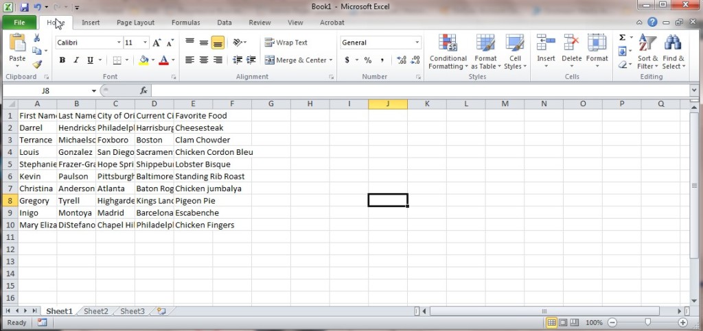
Placing images into your Excel worksheets can be beneficial for several reasons. For one, doing so can help pair product photos with their inventory descriptions…
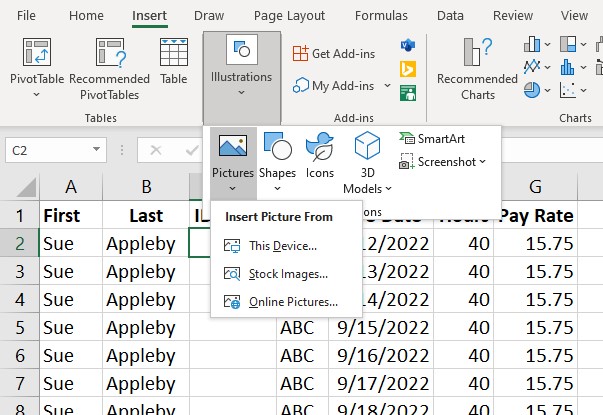
Placing images into your Excel worksheets can be beneficial for several reasons. For one, doing so can help pair product photos with their inventory descriptions…
The Pivot Table is one of the most useful features in Excel. Sorting data with Excel Pivot Tables allows you to examine your data from…
Excel Dashboards empower you to display your data in interactive and dynamic ways. They give you a comprehensive snapshot of your data and save you…
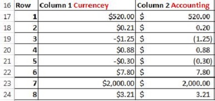
If you’ve ever wondered why there is an accounting format in Excel when there is already a currency format than you are not alone. Creating…
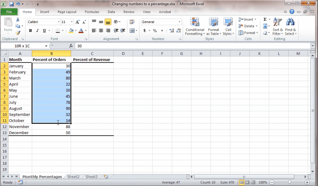
Cell formatting in Excel allows you to represent your numbers in a variety of ways: as a date, as a percentage, as currency, and with…
When it come to Excel formatting, there are so many options and tools that it can be a little overwhelming trying to determine what to…
Today’s excel tip is very simple but can make a difference when staying organized in excel. If you have more than one worksheet in your…
One of the most common fears of Excel is getting unruly data files and not knowing how to quickly and easily format it to look…
Using Excel in the workplace, or for personal needs, is made much simpler when you know who to use all of the tools and features…
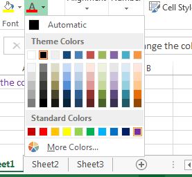
One of the best ways to keep an Excel spreadsheet organized is with color coordination. A personal favorite here at Learn Excel Now is white…
Please confirm you want to block this member.
You will no longer be able to:
Please note: This action will also remove this member from your connections and send a report to the site admin. Please allow a few minutes for this process to complete.