
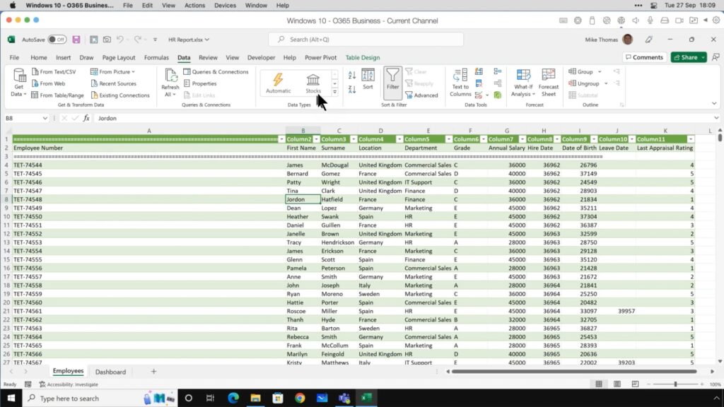
Merge and Manipulate Multiple Excel Sheets like a Pro
Working with multiple Excel sheets is common for many spreadsheet users. However, managing and consolidating data across worksheets and workbooks can be tedious and time-consuming…
Working with multiple Excel sheets is common for many spreadsheet users. However, managing and consolidating data across worksheets and workbooks can be tedious and time-consuming…
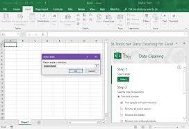
Data is the foundation of any analysis, decision-making process, or business strategy. However, raw data seldom comes perfectly organized and error-free. That’s where data cleaning…
The XLOOKUP function is relatively new, and it was introduced to provide solutions for some of the issues that commonly occur when using the VLOOKUP…
HLOOKUP is a function that Excel users can key in to look up and retrieve data from a specific row in a table. This function…
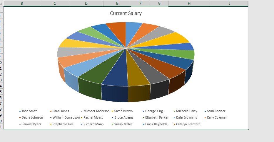
Excel has many tools to help you master the look and feel of your spreadsheet. One feature it offers is the ability to add images…
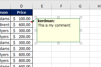
In Excel, you can add a comment to any cell. This could be a note to yourself, a reminder, a correction, a question – anything…
Today’s Excel blog post comes directly from a Learn Excel Now customer who was having trouble formatting her spreadsheet. She wanted to hide the extra…
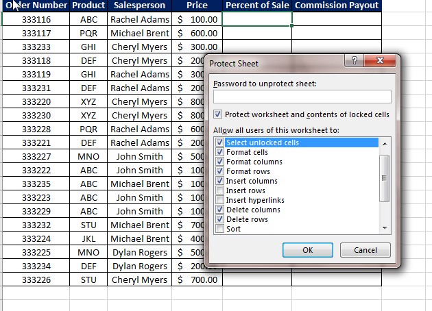
There are various skills everyone should learn in Excel. One of those skills is protecting an Excel worksheet. Excel allows you to add protection to…
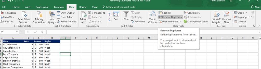
This Excel tip from Learn Excel Now is on removing duplicates in Excel. The request is directly from a Learn Excel Now fan who asked…
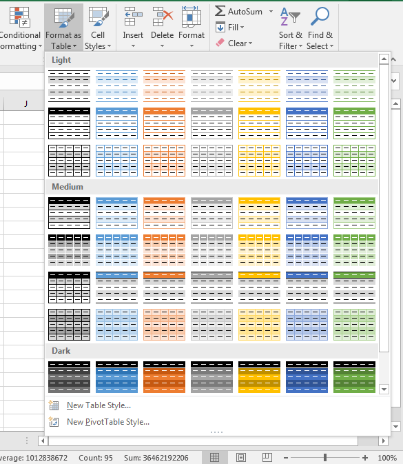
Excel provides you with many preset formatting options that you simply need to click to activate. One of the most common and most useful is…
Please confirm you want to block this member.
You will no longer be able to:
Please note: This action will also remove this member from your connections and send a report to the site admin. Please allow a few minutes for this process to complete.