Learn Excel Now

Conquer the Fear of Excel

  • Home
  • Training
    • Excel
    • MS Office
    • Outlook
    • PowerPoint
    • Word
    • OneDrive
    • Google
  • All-Access
  • eLearning
    • Excel Foundations
    • Micro Courses
      • Simply Excel
  • Resources
  • Login

Excel Dashboards: Your Guide to Getting Started

March 2, 2016 by Tyrone Pernsley

Excel Dashboards empower you to display your data in interactive and dynamic ways. They give you a comprehensive snapshot of your data and save you the time and energy, because you don’t have to perform your own analysis. They are very customizable and allow you to help steer attention to key trends, comparisons, and exceptions. Essentially, dashboards are a great tool for putting all of your information in one place and making it easy to read. This walkthrough of Excel Dashboards will teach you all the basics to create and use your own dashboard.

Excel Dahsboards Featured Image

What to Include in Your Dashboard

The most important question to keep in mind when you’re creating your dashboard is what is important? To display the most important and relevant data, you should keep a few things in mind:

Your Key Performance Indicators – Examples include:

  • New customer acquisition
  • Demographics of potential customers
  • Turnover
  • Outstanding balances
  • Cycle time
  • Availability

Decision Points – Examples include:

  • Status of an ongoing operation
  • What’s going on in a certain area

Gap to Goal: Graphics that display how close the actual results are to goal is helpful information.

Finally, you need to consider the end-user. You need to make it user-friendly and relevant to them or your dashboard won’t be useful. You need to customize it to fit their terminology, objective, and scope of influence, so that they can understand and use it effectively.

Creating a Dashboard

Once you’ve decided on your key criteria, you will need to create the Dashboard.

To do this:

  • Go to a black sheet to create the background for the dashboard.
  • Go to the Drawing Tools section of the “Format” tab
  • Change the fill color of the cells in the worksheet or add shapes
  • Next, you can create charts, graphs, and tables to add using the data from your other spreadsheets.

After you create the visual parts of your dashboard, you’ll need to cut and paste the charts, graphs, and tables to the spreadsheet with your recently created background. From there you can arrange your visuals in a logical order and apply different effects to them.

Elements to Add to Your Dashboard

On your dashboard, there are many ways to represent your data. Here are a few examples of elements that you can add to your dashboard to represent your data.

Dashboard image 1.jpg

  • Gauges: This is good to use if you have a single value that you want to compare to a goal, because it lets you show how well you are progressing by pinpointing where your data falls as compared to where you want and don’t want it to be.
  • Bar Charts: This type of chart is good for comparing different related parts of a whole. For example, they can be used to show something like overall sales as compared to how well each product/service sells.
  • Heat Maps: Maps like this can be used to show trends. For example, you can see where a certain product is popular or sells best.
  • Charts & Graphs: Charts and graphs are a quick and easy way to show your data graphically. They let you easily identify trends in the data and make conclusions.
  • Table: This type of graphic works well for organizing and filtering a set of data that can be easily interpreted.
  • PivotTable: This type of graphic is perfect for taking a long and complicated table and making it more relevant and use-friendly by highlighting the important information.

Creating an Interactive Dashboard

Interactivity allows the viewer to interact with the dashboard, by going to the spreadsheet containing the raw data that is summarized by the chart, graph, or table or changing the data that is shown.

To create an interactive button:

  • Add a shape (for example a rectangle) to your dashboard.
  • Apply the effects and formatting that you want
  • Add text to describe where the button will take the viewer or what it will do.
  • Finally, to add the interactivity, you will need to hyper link the button to the spreadsheet you want it to be linked to.

To add the hyperlink:

  • Go to the “Insert” tab and click on “Hyperlink.”
  • From there, select Link to “Place in This Document.”
  • You can then select the sheet and cell that you want the button to be linked to.

Excel Dashboard image 2.jpg

You can also choose to link your button to a web page, another type of document, or a graphic by inserting the location you want in the “Link to” section of the Hyperlink dialog box.

We here at Learn Excel Now hope you feel confident in your ability to start using Excel Dashboards. It is our desire to bring you the best advice possible to effectively and efficiently use your desktop features so you can focus on your work.

If you are looking for more in-depth Excel Dashboard training, please join us for:

Excel Dashboards for Beginners: Present Your Data Like a Pro on Wednesday, March 23, 2016

Like Learn Excel Now? Join our newsletter and share our content on social!

Kevin – Learn Excel Now

Excel Analytics: Creating Tables for Your data

February 3, 2016 by Tyrone Pernsley

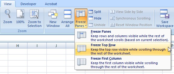
There are a variety of ways to sort and organize your data in Excel. These features allow you to quickly process data to get essential analytics, statistics, trends and other information to inform decision-making. One feature is using Excel tables. Excel Tables are great way to quickly and easily organize and display your data. The following quick guide will provide you with tips, so you can start creating Tables for your data.

Creating a Table

To create a table, first highlight the data that you want included, then go to the “Insert” tab on the top toolbar and select “Table.”

Creating Tables Image 2

Your table will be created, and you will automatically be in the “Design” tab.

Creating Tables Image 3

Now, you can choose how you want your table to look by choosing from the different table styles. You can choose from a variety of different colors and then you can choose color density from light to dark. There is also a quick shortcut that you can use to insert a table. To use this, highlight your data, and then click “Ctrl” + “L.” Your table will be created automatically and then you can design it.

Filtering and Sorting the Data in Your Table

Creating tables image 4Once you have created your table, each column heading will have a drop-down box that automatically appears in the column heading in the top row. The down arrow key allows you to open the drop-down menu.

You have different options to sort the data in the drop-down box. From there, you can sort the data alphabetically, by highest or lowest value or by color.

Excel Analysis Creating Tables for Your Data Filter

To filter your data, you can customize number or text filters by specifying the values that you want hidden or shown. You can also exclude values that you don’t want show by unchecking the check box next to the value(s) that you want hidden.

Excel Analytics- Simple Tables image 5.jpg

Making Calculations in Your Table

You can use calculations to find the totals, averages, and various other calculations for columns or rows. To do this, you have two options. First option: you can click on the cell at end of the column or row and click on the “AutoSum” button.

Creating Tables for you data gif 2

The other option is to select the cell at the end of the column or row, then go to the “Formulas” tab and select the formula that you want to use. When the formula is added to the table, a drop-down arrow is automatically inserted to the right of the value. From the drop-down options, you can choose different formulas to perform other calculations on that row or column.

Creating Tables for you data gif 3

We here at Learn Excel Now hope you now feel confident in creating tables for your data in Excel. It is our desire to bring you the best advice possible to effectively and efficiently use your desktop features so you can focus on your work. Subscribe to our blog to receive weekly Excel tips. If you’re looking for more in-depth training check out our upcoming instructor-led, live online training.

Liked this Excel Tables quick guide? Have questions? Leave your comments below; we’d love to hear from you.

Getting Social with Excel: Spread the word and share the knowledge!

Kevin – Learn Excel Now

Excel Database Tips: Keys to Organizing Your Data

December 30, 2015 by Tyrone Pernsley

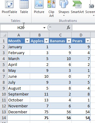
An Excel database is a great way to organize your data. It includes a series of records in rows with fields of data entered in columns. Here are some tips to make using Excel as database easier.

Organizing Your Data

To use Excel as a database, your data has to be structured in a specific way. First, each column has to contain the same category of data in every row of that column. Similarly, each row must contain all of the data for the same one thing (person, group, organization, object, etc). To indicate this thing that the row represents, the first column of each row must contain a unique name. The top row must contain a unique column heading for each column to indicate which data is stored in that column. This top row containing the column headings should be formatted differently than the rest of the data to make the headings stand out. If you have a long database, you can freeze that top row, so that you can always see the column headings even as you scroll down. To do this, go to the “View” tab and click on “Freeze Panes.” From there, click on “Freeze Top Row.” When entering your data, make sure to keep your data formatted in the same way throughout your spreadsheet. You also want to make sure that you didn’t leave any rows blank. You can have blank cells throughout the database, but you can have blank rows or it will mess up your data when you try to sort or filter it.

Excel Database image 1.jpg

Sorting Data

To sort your data, go to the “Data” tab and click on the “Sort” button. The dialog box will pop up, and you will need to choose which column you want the data to be sorted by. Then you will need to choose what you want the sorting to be based upon (ie. values, cell font, cell color, etc). Finally, you will need to choose how you want the data to be sorted (ie. smallest to largest, a certain color on top/bottom, etc).

Excel Database image 2.jpg

Remove Duplicates

To remove duplicates in your database, select the database area, and then go to the “Data” tab and under “Data Tools” click on “Remove Duplicates.” A dialog box will appear and prompt you to mark the columns that you want to examine for duplicate values. The duplicates will be removed and the dialog box will display the results. However, this command can’t be undone, so make sure you select the correct columns to examine for duplicate values. To verify that you are selecting the correct columns, you can highlight the duplicate values by going to “Conditional Formatting.” Then select “Highlight Cell Rules” and select “Duplicate Values.” The duplicate values will be highlighted and you can verify that those are the values that you want removed.

Excel Database image 3.jpg

AutoFilter

The AutoFilter shows a partial list of data based on a certain criteria. To set up this filter, go to the “Home” tab and click on “Sort & Filter” or you can go to the “Data” tab and click on “Sort & Filter” and select “Filter.” Then you’ll be able to use the drop-down arrow to select a subgroup of records that you want shown. To do this, remove the checkmark from “Select All” and check only the items you want to display. To clear the filter, click on “Select All” from the drop-down list or click on “Clear Filter.”

We here at Learn Excel Now hope you now feel confident in your ability to create an Excel Database. It is our desire to bring you the best advice possible to effectively and efficiently use Excel so you can focus on your work. Subscribe to our blog to receive weekly Excel tips. If you’re looking for more in-depth training check out our upcoming instructor-led, live online trainings.

Liked these Excel Database tips? Have questions? Leave your comments below; we’d love to hear from you.

Getting Social with Excel: Spread the word and share the knowledge!

Kevin – Learn Excel Now

Easily Combining Excel Charts

December 2, 2015 by Tyrone Pernsley

Combine Charts image1
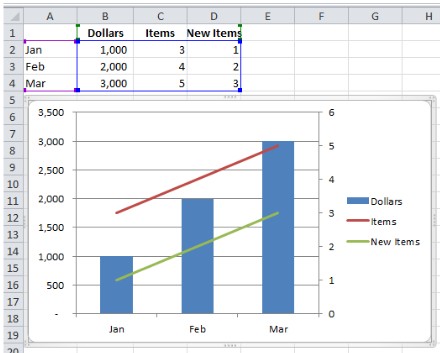
Learn Excel Now brings you our tip of the week: easily combining Excel charts. [Read more…]

Using Auto Calculations for Multiple Tasks – Video

November 18, 2015 by Tyrone Pernsley

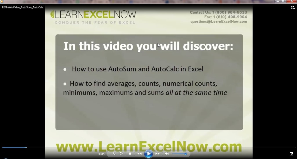
In Excel, there are multiple ways to Auto Sum a range of data. [Read more…]

All Access Subscription
Our 1-year all-access subscription provides step-by-step guidance for mastering Microsoft Office applications, with workshops, exercises and quick reference eGuides. It's perfect for anyone that needs to brush up on certain skills or even folks who need to learn the programs - from a beginner’s level.
Excel Foundations
Take the fear out of Excel with this 20 module self-paced training course. You will cover the most essential topics to develop a solid foundation of Excel or a lifetime of mastery.

Learn Excel Now helps you conquer the fear of Excel. By providing self-paced and instructor-led training and free strategies and guides, we leave no Excel mystery unsolved.

  • Home
  • Training
  • All-Access
  • Excel Foundations
  • Resources

Connect with Us

  • Facebook
  • Linkedin

Contact

Learn Excel Now
questions@learnexcelnow.com
1-484-259-7664 or 1-800-964-6033
660 American Ave
Suite 203
King of Prussia, PA 19406

Microsoft® Office Excel® is a registered trademark of the Microsoft Corporation in the United States and other countries. All rights reserved.

Copyright © 2023 ­Learn Excel Now

Terms of Service

Privacy Policy

Copyright © 2023 · News Pro Theme on Genesis Framework · WordPress · Log in

WELCOME BACK!

Enter your username and password below to log in

Forget Your Username or Password?

Reset Password

Lost your password? Please enter your username or email address. You will receive a link to create a new password via email.

Log In