
Easily Combining Excel Charts
 Learn Excel Now brings you our tip of the week: easily combining Excel charts. In this quick guide, we aim to provide you with methods for quickly and easily combining Excel charts. This feature is useful for comparing and contrasting your data when using Excel in the workplace.
What is a Combination Chart?
A combination chart consists of at least two data series that use different chart types. The purpose of using a combination chart is to view numbers with extreme differences in value. A secondary value axis represents the second set of numbers making it easier to see the differences. (**Bubble charts and 3-D charts can’t be used for combination charts.)
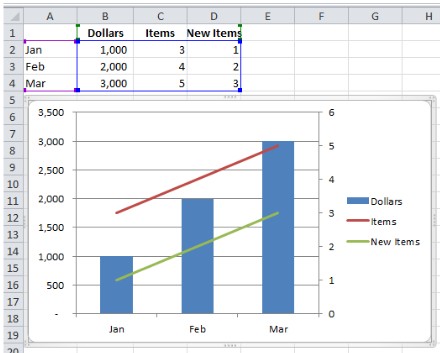
Create a Combination Chart:
First select all the data that you want included in your combination chart, then click “Insert” and choose “Chart” where you can select the type of chart you want to use. After creating the chart, go to “Chart Tools” and under “Layout” click on “Current Selection Group” and then select the secondary data that you want plotted on the chart. Next click on “Format Select” and then choose “Plot Data on Secondary Axis.” To pick what type of chart you want the secondary chart to be, click on “Design” in the “Chart Tools” tab and select “Change Chart Types.” Finally, select the type of chart that you want your secondary chart to be and click ok. Your data will then be displayed as two different types of charts on the same chart.
What is a Trendline Chart?
Trendlines show projected trends forecasted over time, based on your current data. There are six types of trendlines:
- Exponential: Used when data increases or decreases at increasingly higher rates
- Linear: Used for straight lines with linear data
- Logarithmic: Used when data increases or decreases rapidly and then levels out
- Polynomial: Used when data increases and decreases
- Power: Used to compare numbers that increase at a certain rate
- Moving Average: Used to smooth changes in data, showing a pattern of change

Trendline Chart
To add a trendline to your chart, click on the chart, then go to the “Chart Tools” tab and click “Layout.” Select “Analysis Command Group” then “Trendlines” and finally select the type of trendline that you want to use. You can format your trendline by changing the line color and style. To verify how accurate and reliable your trendline is, look at its R-squared value by selecting the “More Trendline Options” on the “Trendline” icon on the Chart Layout tool bar. Then, check the box “Display R-squared value on chart” on the bottom of the options. The closer the R-squared value is to 1, the more reliable the trendline.
Liked this Excel combined charts guide? Have questions? Leave your comments below; we’d love to hear from you.
Getting Social with Excel: Spread the word and share the knowledge!
Kevin – Learn Excel Now