
Excel Dashboards: Your Guide to Getting Started
Excel Dashboards empower you to display your data in interactive and dynamic ways. They give you a comprehensive snapshot of your data and save you the time and energy, because you don’t have to perform your own analysis. They are very customizable and allow you to help steer attention to key trends, comparisons, and exceptions. Essentially, dashboards are a great tool for putting all of your information in one place and making it easy to read. This walkthrough of Excel Dashboards will teach you all the basics to create and use your own dashboard.
What to Include in Your Dashboard
The most important question to keep in mind when you’re creating your dashboard is what is important? To display the most important and relevant data, you should keep a few things in mind:
Your Key Performance Indicators – Examples include:
- New customer acquisition
- Demographics of potential customers
- Turnover
- Outstanding balances
- Cycle time
- Availability
Decision Points – Examples include:
- Status of an ongoing operation
- What’s going on in a certain area
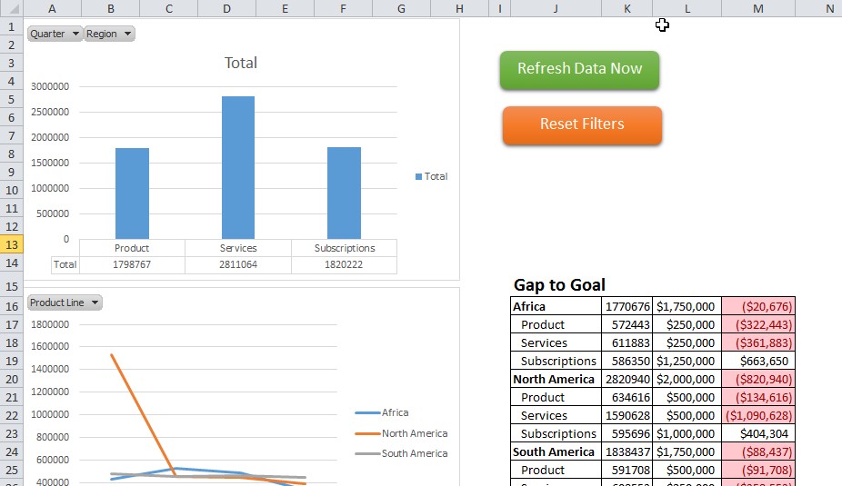
Gap to Goal: Graphics that display how close the actual results are to goal is helpful information.
Finally, you need to consider the end-user. You need to make it user-friendly and relevant to them or your dashboard won’t be useful. You need to customize it to fit their terminology, objective, and scope of influence, so that they can understand and use it effectively.
Creating a Dashboard
Once you’ve decided on your key criteria, you will need to create the Dashboard.
To do this:
- Go to a black sheet to create the background for the dashboard.
- Go to the Drawing Tools section of the “Format” tab
- Change the fill color of the cells in the worksheet or add shapes
- Next, you can create charts, graphs, and tables to add using the data from your other spreadsheets.
After you create the visual parts of your dashboard, you’ll need to cut and paste the charts, graphs, and tables to the spreadsheet with your recently created background. From there you can arrange your visuals in a logical order and apply different effects to them.
Elements to Add to Your Dashboard
On your dashboard, there are many ways to represent your data. Here are a few examples of elements that you can add to your dashboard to represent your data.
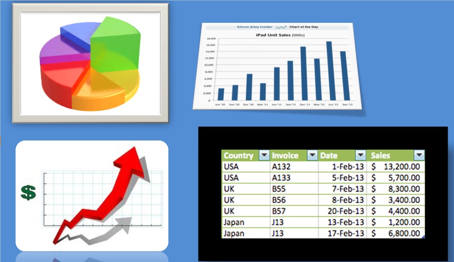
- Gauges: This is good to use if you have a single value that you want to compare to a goal, because it lets you show how well you are progressing by pinpointing where your data falls as compared to where you want and don’t want it to be.
- Bar Charts: This type of chart is good for comparing different related parts of a whole. For example, they can be used to show something like overall sales as compared to how well each product/service sells.
- Heat Maps: Maps like this can be used to show trends. For example, you can see where a certain product is popular or sells best.
- Charts & Graphs: Charts and graphs are a quick and easy way to show your data graphically. They let you easily identify trends in the data and make conclusions.
- Table: This type of graphic works well for organizing and filtering a set of data that can be easily interpreted.
- PivotTable: This type of graphic is perfect for taking a long and complicated table and making it more relevant and use-friendly by highlighting the important information.
Creating an Interactive Dashboard
Interactivity allows the viewer to interact with the dashboard, by going to the spreadsheet containing the raw data that is summarized by the chart, graph, or table or changing the data that is shown.
To create an interactive button:
- Add a shape (for example a rectangle) to your dashboard.
- Apply the effects and formatting that you want
- Add text to describe where the button will take the viewer or what it will do.
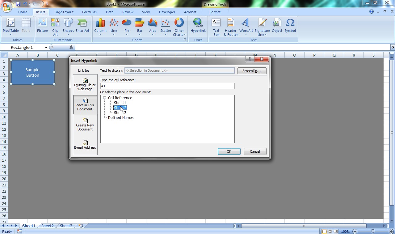
- Finally, to add the interactivity, you will need to hyper link the button to the spreadsheet you want it to be linked to.
To add the hyperlink:
- Go to the “Insert” tab and click on “Hyperlink.”
- From there, select Link to “Place in This Document.”
- You can then select the sheet and cell that you want the button to be linked to.
You can also choose to link your button to a web page, another type of document, or a graphic by inserting the location you want in the “Link to” section of the Hyperlink dialog box.
We here at Learn Excel Now hope you feel confident in your ability to start using Excel Dashboards. It is our desire to bring you the best advice possible to effectively and efficiently use your desktop features so you can focus on your work.
If you are looking for more in-depth Excel Dashboard training, please join us for:
Excel Dashboards for Beginners: Present Your Data Like a Pro on Wednesday, March 23, 2016
Like Learn Excel Now? Join our newsletter and share our content on social!
Kevin – Learn Excel Now