
Tips and Tricks for Using Visual Tools in Excel
Excel has many visual tools built in to help you effectively display your data. With features like themes, tables, and SmartArt, you can easily make your data viewer-friendly. Check out these tips to help you effectively use Excel Visual Tools.

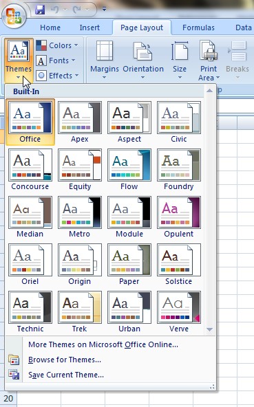
Themes:
Themes help you make quick adjustments to the entire workbook for consistent colors and fonts. To choose a theme, click on the “Themes” button on the “Page Layout” tab. The themes you can choose from involve different color schemes and formatting that affect your font, cell background colors, and other colors throughout charts and diagrams. Identical themes exist in Work and PowerPoint, so it’s simple to standardize the appearance of different file types for the same project.

Form Controls:
These help you create interactive worksheets, which allows you to make your data more interesting and user-friendly. To use form controls, go to the “Developer” tab and click on the “Insert” button. From there, you can choose from buttons, combo buttons, check boxes, spin buttons, list boxes, option buttons, and scroll bars. After selecting the one you want to use, click and drag it into your spreadsheet. When it’s in place, right click the control and select “Format Control”. You will then need to choose which cell(s) you want to be associated with that control.

Tables:
Convert your data to tables to make list organization and dynamic charts easier. You can quickly create a table to organize your data by clicking on the “Format as Table” button on the “Home” tab. You’ll be prompted to pick a style and you can choose from different formats and color schemes. In a table, new formulas you enter are automatically copied down the column to make it easier to make calculations.
You can convert data into a table in four different ways:
- Press “Ctrl” + “t”
- Press “Ctrl” + “l”
- On the “Home” tab, click on the “Table” button
- On the “Insert” tab, click on the “Table” button
Once this chart has been created, any new column you add on the right-side or any row on the bottom of your source data will automatically be added to the chart. If you insert or delete rows in a table, the color scheme adjusts automatically
Sparklines:
This feature allows you to create in-cell charts that give you a quick visual representation of your data. It complements your data well and allows you to display important trend information. You can display trends in a single cell in a few ways: line, column, or win/loss. To insert a sparkline in your spreadsheet, go to the “Insert” tab and click on the “Sparkline” button. From there, indicate where you want your sparkline to go and click “Ok”.
(insert image 3 here)
SmartArt:
SmartArt gives you 200+ options for creating charts, process flow diagrams, Venn diagrams, and more. To use SmartArt, go to the “Insert” tab and click on the “SmartArt” button. From there you will be able to choose which type of graphic you want: list, process, cycle, heriarchy, relationship, matrix, pyramid, or picture. Select which type of graphic you want, then select from the styles in that category.
Display Your Data as an Outline:
When working with a lot of data, you can display your data as an outline so you can quickly expand or collapse the view of the data. To enable this feature, go to the “Data” tab and click on the “Group” button. Select “Auto Outline”. From there you can click on the different outlining levels, which are on the left, above the data, to expand and collapse your data. If you want to hide or display outline number levels, you can do this easily by pressing “Ctrl” + “8”.
Kevin – Learn Excel Now