
Excel Charts: Quick Tips for Getting Started
Excel’s true power starts with storing and analyzing data but really begins to jump of the page with Charts. Excel charts allow users to graphically represent their data in a meaningful way. Users can easily create and customize charts. With the power of Charts, you can quickly summarize data, compare and track trends over time and see how your business is performing. You also have a tool to quickly report these numbers to colleagues and superiors.
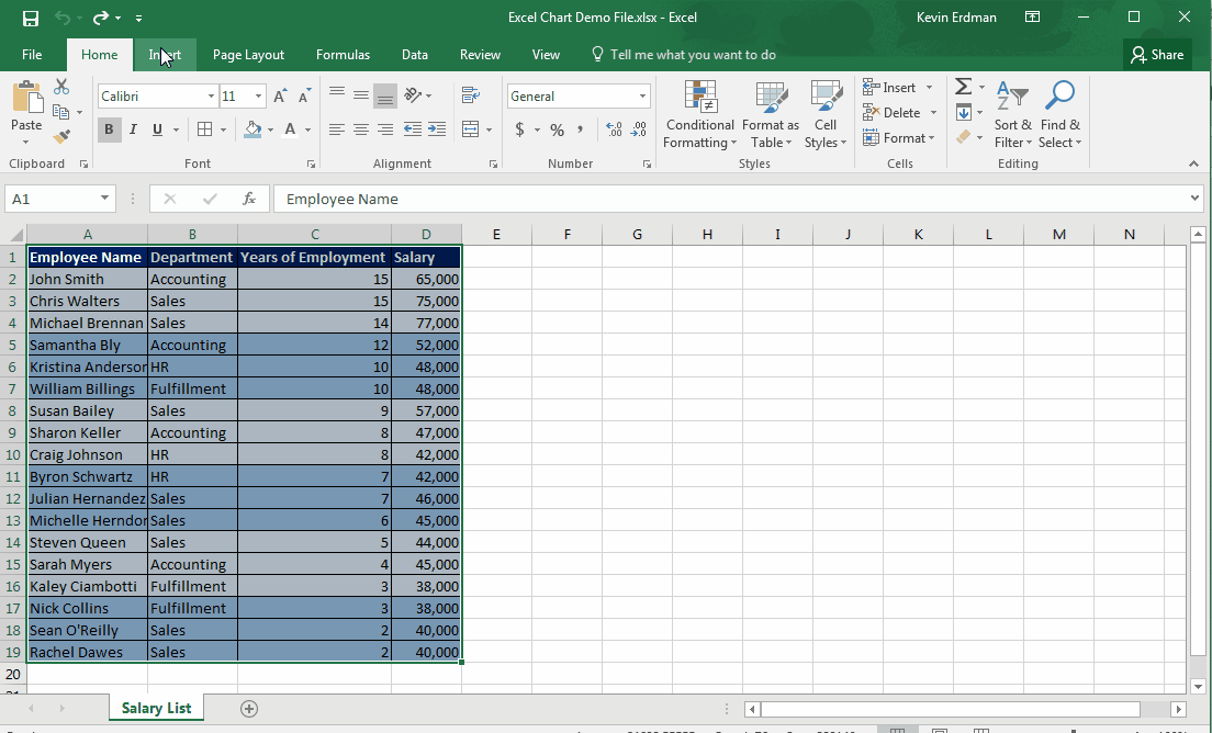
Today, we are going to focus on creating an Excel Chart.
To create a chart, you would:
- Select the data you want to appear on the chart
- Go to the Insert ribbon and select the type of chart you want to use
Pro tip: there are also keyboard shortcuts to create charts:
Press F11 – a chart appears on a new workbook tab (worksheet)
Press Alt+F1 – a chart will appear on the same worksheet as the data source*
*When selecting charts from the Insert ribbon, they automatically appear on the same worksheet.
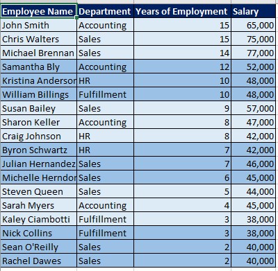
Source Data for Your Chart
The quality of your chart will depend on the quality of the source data that goes into the chart. Here are a few pointers to help you create the best chart possible:
- Select numerical cells – these will render better in the chart
- Have a column label on the first row of each column describing the data
- Have a row label in the first column of each row describing the data
- It is usually best to not include totals, averages, percentages, etc. – your chart will calculate these
Creating Chart from a Pivot Table
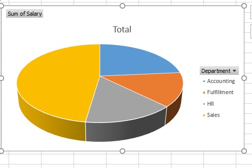
Now, let’s say you wanted to take our Salary list chart and break it down even further. In this instance, we are looking at Total Salary by Department.
To create a chart from a Pivot Table, you would:
- Create the Pivot Table from the sources data
- Move “Department” to Axis (row labels)
- Move “Salary” to Values
- Select the chart you want to use
And now, as you can see, we have a chart quickly showing the breakdown of salary by department.
We here at Learn Excel Now hope you enjoyed these simple tips for getting started with Excel Charts. This just begins to scratch the surface of all the things you can do with Excel Charts, but shows the necessary beginning steps. Stay tuned for more Excel tips from Learn Excel Now.
Like Learn Excel Now? Share this article and our other content with your social networks.
Kevin – Learn Excel Now
Responses